Sophisticated Suburban Style on the Outskirts of Alexandria
This interior in King Marriott by Reham Maher has subtle colors, smooth textures that create a soothing, contemporary aesthetic.
In suburban Alexandria, King Mariout is a neighbourhood full of getaway villas for many, and permanent homes for some, all tucked away from the noise of the city in a wreath of gardens. In the midst of this Alexandrian comfort is a villa designed by Reham Maher Interiors. Full of calm colours, comfortable linen and generous greenery, the villa is a medley of contemporary spaces that blend classic elements with modern design.
-4dd03857-9ec6-4a33-aae2-c6232cdfbda0.jpg) “The client wanted a light home, cozy and relaxing, while at the same time, visually rich,” Reham Maher tells #SceneHome. “To achieve this mix, I relied on calm colours that are enriched with gold and greenery.” This is evident when stepping through the entrance; the floors and walls are covered with white while natural light brightens it up through a glass façade that overlooks the outdoor landscape.
“The client wanted a light home, cozy and relaxing, while at the same time, visually rich,” Reham Maher tells #SceneHome. “To achieve this mix, I relied on calm colours that are enriched with gold and greenery.” This is evident when stepping through the entrance; the floors and walls are covered with white while natural light brightens it up through a glass façade that overlooks the outdoor landscape.
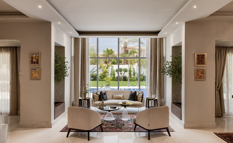
-44897af2-075a-4156-8053-163c962ccf3b.jpg) Once the brightness settles in, the soothing aesthetics of the reception area becomes clear. Showcasing soft hued furniture that are comfortable in their texture, and stylish by design. While the linen drapes are plain, the rugs are rich with oriental patterns and Moorish colours, which is also the case in the dining area. “Aside from their traditional aesthetic, these are actually weathered rugs, the fact that they are old adds a sense of antiquity to the space,” Maher continues. “I was raised in a household full of classic antiques, which influenced my taste. Modern spaces sometimes need to be grounded with classical elements as they are timeless and never fall out of trend.”
Once the brightness settles in, the soothing aesthetics of the reception area becomes clear. Showcasing soft hued furniture that are comfortable in their texture, and stylish by design. While the linen drapes are plain, the rugs are rich with oriental patterns and Moorish colours, which is also the case in the dining area. “Aside from their traditional aesthetic, these are actually weathered rugs, the fact that they are old adds a sense of antiquity to the space,” Maher continues. “I was raised in a household full of classic antiques, which influenced my taste. Modern spaces sometimes need to be grounded with classical elements as they are timeless and never fall out of trend.”
-5973140c-2639-4251-b52f-23fd49b6b1db.jpg) Maher’s blend of the old and new is epitomized in the library she designed. Wood veneer adds warm modern vibes. Gold leaves are Maher’s way of instilling classical visuals, while the dark mirrors function as more than just reflective surfaces. “I love mirrors!” Maher says. “They add a feeling of spaciousness. Plain ones provide a modern look, however, the darker they get, the deeper their visual appeal is, which is usually more chic.” She used dark mirrors at the entrance as well, subtly pairing it with gold. Bold.
Maher’s blend of the old and new is epitomized in the library she designed. Wood veneer adds warm modern vibes. Gold leaves are Maher’s way of instilling classical visuals, while the dark mirrors function as more than just reflective surfaces. “I love mirrors!” Maher says. “They add a feeling of spaciousness. Plain ones provide a modern look, however, the darker they get, the deeper their visual appeal is, which is usually more chic.” She used dark mirrors at the entrance as well, subtly pairing it with gold. Bold.
-4039674f-8284-4b0b-b2b5-63f0e56d65d2.jpg) “There were columns in the middle of the reception area, so we utilized them by adding flower boxes and inserting greenery to provide life into the space. It affects the mood and adds cheerfulness,” she adds, nonchalantly. Juxtaposing the reception area with greenery was not the only time she did this. The white staircase with its glass handrails is also bordered by two plants, one that is light pink and one that is green, creating a soothing scene that celebrates contrast.
“There were columns in the middle of the reception area, so we utilized them by adding flower boxes and inserting greenery to provide life into the space. It affects the mood and adds cheerfulness,” she adds, nonchalantly. Juxtaposing the reception area with greenery was not the only time she did this. The white staircase with its glass handrails is also bordered by two plants, one that is light pink and one that is green, creating a soothing scene that celebrates contrast.
-3bb06810-79d1-4129-acd3-c4491448139f.jpg) When we reach the master bathroom, one is struck with a sense of absolute luxury. When faced with its spaciousness, Maher opted to coat it completely in white marble. A space that visually feels like a cloud.
When we reach the master bathroom, one is struck with a sense of absolute luxury. When faced with its spaciousness, Maher opted to coat it completely in white marble. A space that visually feels like a cloud.
“When you combine the old and the new, you get a contemporary look,” Maher concludes. Whether or not you agree with this statement, the designer’s ability to combine modern and classic elements whether it be through textures or colors is undeniable.
Photography credit: Nour El Refai.
- Previous Article The Enduring Charm of Jeddah’s Old Town of Al Balad
- Next Article Egypt's ‘Style Design’ Works Wonders on Grenada Resort 'Silversands'


