How Nomo Design Co. Gave This Summerhouse Character in Monochrome
While most summerhouses boast their character through wild colours and popping patterns, this does so in monochrome.
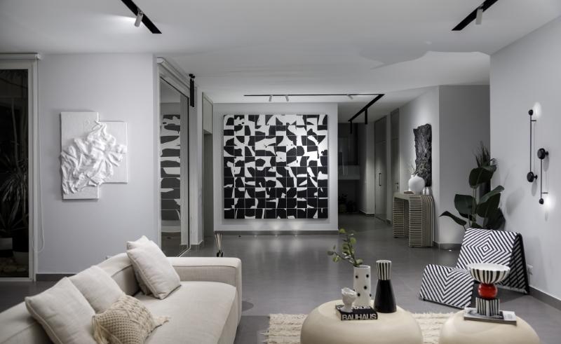
There’s an ease to monochromatic designs - not only do their uniform colour choices make them easy on the eye, they’re also convenient for designers since they allow for a wide variety of elements to be included without being overwhelming. This is why Nourhan Hazem, founder of Cairo-based multidisciplinary studio Nomo Design Co., opted for a black and white theme in this Seashell summerhouse to cater to the owner’s seemingly contradictory requests.
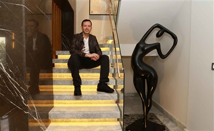
-8dfa45dd-f0fb-4eb4-905a-f6c84eb56c4b.jpeg) “The challenge in this summer house was that the owner wanted a simple yet eccentric home, so I decided to go for a monochromatic palette that was calm yet still provided a different character to the spaces,” Hazem tells #SceneHome. The designer graduated with a degree in architectural engineering from the American University in Cairo and founded her firm in 2021 with a vision to lead and set standards within Egypt’s booming design scene.
“The challenge in this summer house was that the owner wanted a simple yet eccentric home, so I decided to go for a monochromatic palette that was calm yet still provided a different character to the spaces,” Hazem tells #SceneHome. The designer graduated with a degree in architectural engineering from the American University in Cairo and founded her firm in 2021 with a vision to lead and set standards within Egypt’s booming design scene.
-0541286e-98f3-4b2f-a170-ea863ba77037.jpeg) “Design has always been my passion and my favourite part is to get to work with different patterns and blend materials together,” she continues. “A monochromatic design allows textures and patterns to pop out. That’s why there is not a piece of furniture or wall that wasn’t used to add depth and make the spaces more interesting.”
“Design has always been my passion and my favourite part is to get to work with different patterns and blend materials together,” she continues. “A monochromatic design allows textures and patterns to pop out. That’s why there is not a piece of furniture or wall that wasn’t used to add depth and make the spaces more interesting.”
-749e6b69-84b9-48c0-9a30-d8560a5b5791.jpeg) Being bright is the main feature of the house, with a design that is emphasised with patterned black and white furniture such as the undulating signature chair and the side console. “White felt powerful but also risky because it effortlessly brings a sense of tranquillity to the space,” she says.
Being bright is the main feature of the house, with a design that is emphasised with patterned black and white furniture such as the undulating signature chair and the side console. “White felt powerful but also risky because it effortlessly brings a sense of tranquillity to the space,” she says.
“Instilling abstract ideas and inspirations such as a distinctive wall art helped add a tangible sense of beauty to the house,” she adds. Given the coastal nature of the house, sculptural artworks resembled the movement of the sand and sea. Then Hazem would add an element that re-abstracted the visuals once more, such as a huge black and white grid artwork.
-a99590ef-5b76-4315-9f34-21b1e4960d88.jpeg) Aside from adding bold statement pieces to the space, Hazem was also keen on using natural materials. “I preferred using White Carrara marble to highlight elements such as the TV wall unit and the bar, while using wood to add a warm feeling to the space,” she explains. “I usually seek out visually interesting elements that stand out on their own yet also work well when put together. It’s like putting puzzle pieces together to create a beautiful end image.”
Aside from adding bold statement pieces to the space, Hazem was also keen on using natural materials. “I preferred using White Carrara marble to highlight elements such as the TV wall unit and the bar, while using wood to add a warm feeling to the space,” she explains. “I usually seek out visually interesting elements that stand out on their own yet also work well when put together. It’s like putting puzzle pieces together to create a beautiful end image.”
-3a8cbc97-b3d5-4b4d-8403-ef835206ca1f.jpeg) As Hazem sets her mind on leading her firm to the forefront of the design industry, she’s making sure to support homegrown talents and making them part of her ambition on going from local to regional and global. Pieces such as carved coffee tables, stone pendants and accessories were handmade by local emerging artists, which Hazem relied on to deliver her client’s vision and bring it to life.
As Hazem sets her mind on leading her firm to the forefront of the design industry, she’s making sure to support homegrown talents and making them part of her ambition on going from local to regional and global. Pieces such as carved coffee tables, stone pendants and accessories were handmade by local emerging artists, which Hazem relied on to deliver her client’s vision and bring it to life.
- Previous Article The Enduring Charm of Jeddah’s Old Town of Al Balad
- Next Article Downtown Cairo's Iconic Cinema Radio Gets Gorgeous Gatsby-esque Revamp


