
Verhaal Studio Scripts a Dining Drama at Dubai’s OTHER
In Dubai's Al Safa district, Verhaal Studio designs OTHER as a 'living canvas,' where a bold dialogue of architectural blue and lipstick red sets the stage for a curated culinary performance.

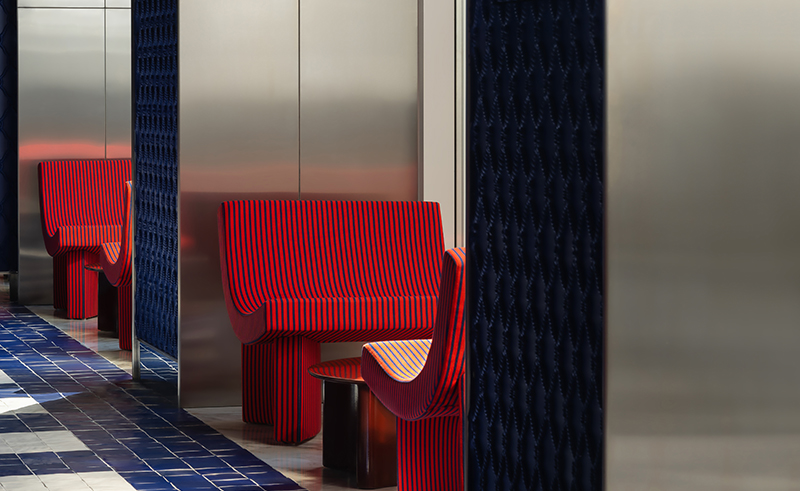
In Dubai’s Al Safa district, behind a discreet façade, a chromatic duet is underway. A deep, architectural blue holds the room in a steady embrace. Countering it are strokes of lipstick red vacillating with theatrical heat.
Conceived by The Food District and designed by Verhaal Studio, OTHER is a new design-led restaurant that operates as a canvas where design performs in curated tension. Its stage is set mid-scene— charged, intentional, and alive with possibility. Co-founder Neydine Bak describes it as “a space where art emerges as an intrinsic layer of the architecture itself.”
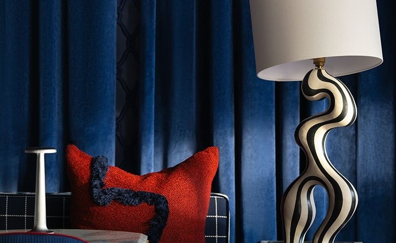
The narrative is anchored by a bold colour strategy, inspired by the disruptive palette of a 2020 Balenciaga runway. “Architectural blue forms a controlled, almost severe canvas, acting as a stage set,” Bak explains, “while lipstick red is introduced as heat, interruption and glamour.” The contrast of colours exists in a screen-played dialogue. The blue, a deep, enveloping tone on the main wall, grounds the space. The red, appearing in velvet cushions, artful accents, and flashes of trim, punctuates it with rhythm, surprise and playfulness.
Stepping inside the space, the spatial plot unfolds into a narrow plan, bordered by full-height glazing, grounded by a single, continuous wall. The wall acts as both anchor and gallery, a saturated blue plane against which the drama of the interior is staged. The layout is a series of curated sight-lines encouraging discovery. Movement through the space becomes an unveiling; a sculptural object here, an intimate seating nook there.
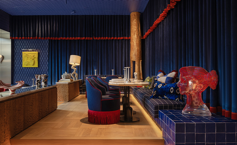
Materials speak the same language of contrast. A graphic twisted-rope motif is translated into sculptural relief plaster, casting soft shadows and nodding to ornamental traditions. It meets the crisp rhythmic geometry of hand-painted blue-and-white tiles that wrap the base of the room. Neutral, textured flooring grounds the space, while the ceiling —treated as a quiet fifth wall— carries lighting that moves between the warm glow of Rovere-inspired lamps and cleaner, Japanese-influenced lines.
Layers build upon layers. Linen-textured wallpapers repeat the rope motif at a subtle scale, plush velvet drapery softens the glass façade, and reflective surfaces catch the light. The result is a material dialogue that balances matte and gloss, solid and soft, historical reference and modern execution.
True to its concept as a “living canvas,” art is the protagonist. Verhaal curated a collection that activates the space. French ceramicist Inhee Ma’s minimalist vessels offer moments of quiet, grounded refinement. In contrast, Jonathan Adler’s acrylic sculptures inject playful refraction and gleam. The industrial weight of Romein’s sculptural steel vessels punctuates the space, while Norwegian ceramist Johanne Birkeland’s asymmetrical porcelain forms introduce a softer, rippling counterpoint. The emotional crescendo comes from Mamali Shafahi’s bright yellow relief work, framed dramatically in velvet within its own alcove, a jolt of surrealist wonder.
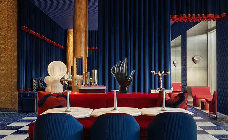
Furniture continues this narrative of eclectic curation. Pieces are selected as “sculptural companions,” mixing eras and materials. Plush, deep-seated banquettes in rich textiles from Dedar contrast with sleek, contemporary chairs. An unexpected, Jeff Koons-like inflatable dachshund bench winks at the room’s inherent playfulness. This layered approach extends to the tabletops. While Verhaal did not design the flatware, the selected serving plates and cutlery uphold the visual language— bold, graphic shapes, a continuation of the contrast philosophy, making the tactile act of dining a seamless extension of the environment.
In a deliberate act of theatricality, the kitchen remains entirely concealed.“The kitchen was very much considered as part of the overall narrative, even in its intentional absence,” Bak notes. This separation heightens the sense of luxury and performance, allowing the dining room to function as a pure stage.
“The interior and the menu are conceived as parallel expressions of contrast and coexistence,” Bak says. Just as the space layers diverse artistic voices, the culinary offering brings together global “delightful eats,” creating a harmonious sense of discovery. The design engages all senses, framing food as both art and experience, while the spatial flow —from more social zones to intimate tables— orchestrates the rhythm of an evening.
The greatest challenge was weaving multiple design eras and styles into a coherent whole that felt fresh, and not fragmented. The solution became the project’s core identity: “curated contradiction.” By anchoring the space with a strong colour narrative and a continuous architectural language, contrasts were allowed to coexist with clarity. Historical motifs are re-scaled and re-coloured through a modern, graphic lens.
The space is designed to evolve. As a living canvas, its art, objects, and styling can rotate, ensuring it remains dynamic and culturally responsive while retaining its foundational identity.
OTHER sidesteps the well-trodden paths of minimalist beige or opulent glitz instead, offering a confident, layered, and intellectually vibrant alternative. It is a space offering luxury as an experiential, sensory story, where guests actively complete its narrative. In the words of the studio’s own ethos, it is a story, formed. And everyone who enters becomes a part of its next chapter.
- Previous Article AD: The Mosques Defining Sacred Architecture in Egypt’s New Capital
- Next Article The Ancestral Resilience of Omar El Farouk’s Fayoum Home
Related Articles
Trending This Month
-

-
 Jun 12, 2026
 -

-